
‹ RETURN TO SELECTED WORK
Keystone
BRAND IDENTITY & CREATIVE DIRECTION
Art direction within Irdeto
THE CHALLENGE
Building a brand from the ground up for a digital access solution aimed at fleet owners. Communicating security, trust and everyday ease, while creating a clear connection to Irdeto and a visual identity relevant to drivers and fleet operations.
MY ROLE
Leading the development of Keystone’s logo and visual identity together with the design team. Defining the creative direction and guiding its application across collateral, advertising, campaigns, video and exhibition graphics.

IDENTITY DEVELOPMENT
A new identity.
A familiar foundation.
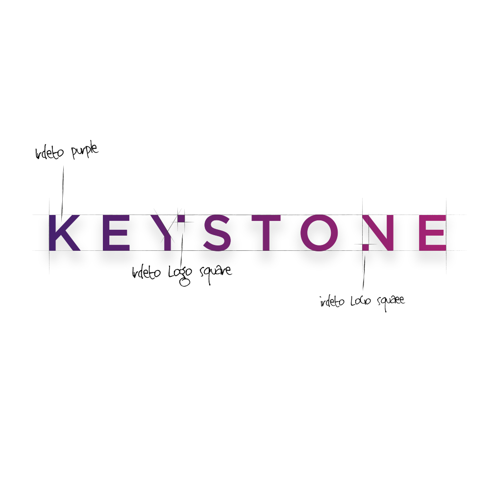
Keystone began without an established logo or visual identity. As an Irdeto product, it needed a recognisable connection to the parent brand while developing an expression suited to fleet owners and the people using its technology.
I used Irdeto’s colours and typography as the foundation, then worked with the design team to develop Keystone’s logo and wider visual language. Building on those shared elements connected the product to Irdeto, while giving it a distinct identity that could work across its own communications.

CREATIVE DIRECTION
Built around the driver.
Fleet owners are Keystone’s primary audience, but drivers bring the benefits of the technology into focus. I centred the imagery on truck drivers and other vehicle users in their daily routines, connecting secure digital access to familiar situations and practical needs.
The visual direction focuses on confidence and ease. Rather than presenting the product only through technical features, the communications show the people it supports and the everyday experience it is designed to simplify.
One challenge was making Irdeto’s purple feel natural in a transport context. I balanced the colour with everyday photography and clear layouts, giving Keystone a recognisable brand presence while keeping the people and message at the centre.

BRAND APPLICATIONS
One identity. Across every touchpoint.
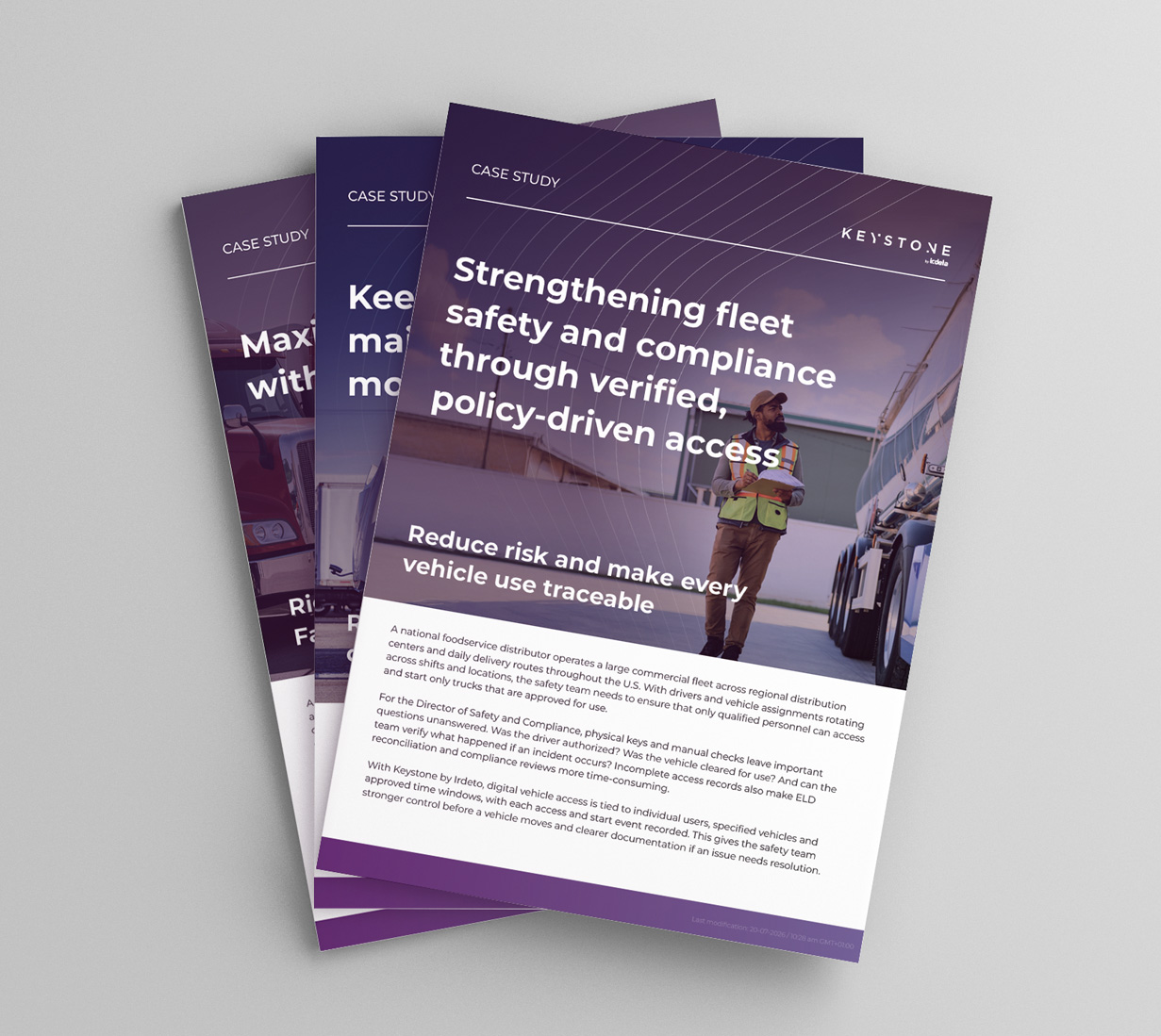
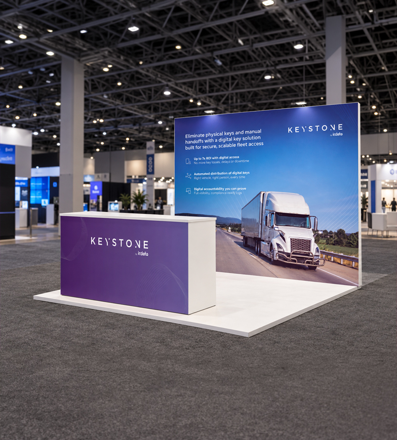
The identity was developed for use across collateral, advertising, campaigns, video and exhibitions. Each application needed to communicate Keystone clearly, whether introducing the product, supporting a sales conversation or creating a presence at an industry event.
Consistent colour, typography and imagery connect these materials, while layouts adapt to the format and the information they need to carry. This gives Keystone a shared visual character across different stages of communication, from an initial introduction to a more detailed explanation.
COLLABORATION
Evolving with every event.
Developed together. Applied with confidence.
As Art Director, I worked with the design team to explore ideas and develop the branding through shared discussion. Involving the team from the beginning helped everyone understand the reasoning behind the identity and how its elements should work together.
That shared understanding supported the transition from brand development to everyday production. The resulting identity has been applied across Keystone’s communications, giving the team a consistent foundation for creating new materials.
NEXT PROJECT ›
Logos